✦ In this article
✦ Key takeaways
- →The vocabulary you need
- →Hierarchy is the whole game
- →How to pair typefaces
- →Body text rules
- →Kerning tells the truth about your work
- →Web fonts vs system fonts
Kerning, leading, tracking, hierarchy and pairing — the fundamentals that make text feel invisible in the best possible way.
This long-form guide from the design team at Oscar Graphix unpacks everything a modern brand, in-house team or freelance designer needs to know about typography basics every graphic designer must master. You'll find field-tested principles, real-world examples, a step-by-step checklist, a structured FAQ and a working glossary — all grounded in years of studio practice across design fundamentals projects for startups, enterprises and cultural institutions alike.
Whether you searched for typography, type design, font pairing because you're preparing a rebrand, building your first identity system, or sharpening your craft as a designer, this article is designed to be read once and referenced many times. Bookmark it — the fundamentals here don't change with the seasons.
Typography is 95% of design. Get the type right and even a plain layout feels premium. Get it wrong and the most expensive photograph in the world cannot save the page.
The vocabulary you need
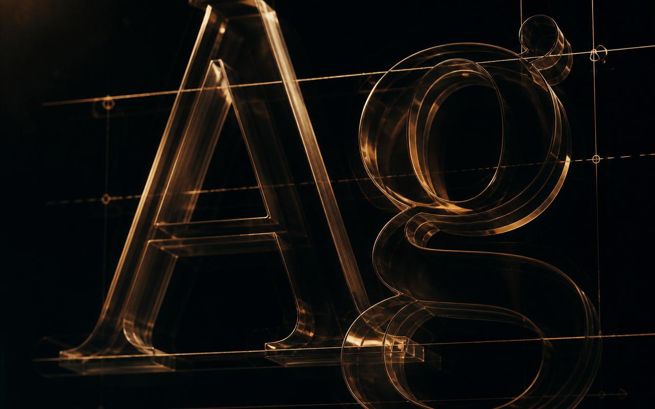
- Kerning — the space between two specific letters.
- Tracking — the uniform space across a whole word or line.
- Leading — the vertical space between lines of text.
- Baseline — the invisible line letters sit on.
- X-height — the height of a lowercase "x"; affects legibility more than font size.
Hierarchy is the whole game
Hierarchy tells the reader what to look at first, second and third. You build it with size, weight, colour and spacing — not with 12 different fonts. A strong hierarchy usually uses just two typefaces and three to four sizes.
How to pair typefaces
The safest pairings contrast one axis and match another. A geometric sans (like Inter or Grotesk) paired with a classical serif (like Playfair or Instrument Serif) works because they share proportion but differ in personality. Avoid pairing two typefaces from the same category — the result is muddy.
Body text rules
- Body copy on screen sits comfortably between 16–18px.
- Line-height should be roughly 1.4–1.6× the font size.
- Line length should stay between 55–75 characters for comfortable reading.
- Left-align long-form copy. Justified text creates ugly rivers on screen.
Kerning tells the truth about your work
Bad kerning is the single fastest way to spot amateur design. Zoom in on your logo and headlines and adjust letter pairs by eye — "AV", "To", "We" and "LT" almost always need help.
Web fonts vs system fonts
Web fonts give personality but cost performance. System font stacks are instant and reliable. A good compromise: one web font for headings, system stack for body.
Type for print vs screen
Print handles thin strokes and small sizes far better than screens. If you designed on a Retina display, always proof at real print size before signing off.
Closing thought
Great typography is invisible. Nobody notices it — they just notice how easy the page is to read. That invisibility is the entire craft.
Going deeper on each section
Every heading above deserves its own study session. Below is a quick recap you can use as a self-audit — read each point, then rate your current work honestly on a scale of 1–5. Anything below a 4 is a candidate for your next iteration.
- The vocabulary you need — revisit this on your current project and note one concrete change you can ship this week.
- Hierarchy is the whole game — revisit this on your current project and note one concrete change you can ship this week.
- How to pair typefaces — revisit this on your current project and note one concrete change you can ship this week.
- Body text rules — revisit this on your current project and note one concrete change you can ship this week.
- Kerning tells the truth about your work — revisit this on your current project and note one concrete change you can ship this week.
- Web fonts vs system fonts — revisit this on your current project and note one concrete change you can ship this week.
- Type for print vs screen — revisit this on your current project and note one concrete change you can ship this week.
- Closing thought — revisit this on your current project and note one concrete change you can ship this week.
A practical checklist you can steal
Print this list, pin it above your desk, and walk through it before you sign off any project of this kind.
- Define the objective and audience before touching a tool.
- Audit existing typography against 3 top competitors and note what you can improve.
- Draft at least 3 distinct directions before refining a single favourite.
- Test at extreme scales — favicon-small and billboard-large — before signing off.
- Check accessibility: contrast, legibility and colour-blind safety.
- Prepare a documented system, not one file — variants, spacing rules, do's and don'ts.
- Ship, measure, iterate. Great typography is version-controlled, not frozen.
Frequently asked questions
Why does typography matter for modern brands?
Typography Basics Every Graphic Designer Must Master directly affects how customers perceive credibility, quality and consistency. In a saturated 2026 market, brands that invest in typography are recognised faster, remembered longer and trusted more — which translates into measurable gains in conversion, retention and word-of-mouth referral.
How long does it take to see results from typography?
Most teams see the first visible improvements within 2–6 weeks of applying the principles in this guide, and compounding results across 3–6 months. The gains are cumulative: consistent execution beats one-off effort every single time.
What tools do designers use for typography at Oscar Graphix?
We combine industry-standard tools — Figma, Adobe Illustrator, Photoshop, InDesign and After Effects — with AI-assisted workflows for research, moodboarding and iteration. The tool matters less than the discipline behind it.
Can small businesses benefit from this, or is it only for large brands?
Small businesses arguably benefit the most. A focused approach to typography lets a small team punch far above its weight, look more established than it is, and compete for attention with much larger competitors.
How does Oscar Graphix approach Typography Basics Every Graphic Designer Must Master?
We start with strategy, not aesthetics — clarifying the audience, the business objective and the constraints. Only then do we move into design, testing every deliverable across the real environments it will live in (screen, print, packaging, social, mobile) before final handover.
Quick glossary
The terms below appear throughout this article and across the wider world of professional design work. Keep them handy.
- typography — a core concept in design fundamentals practice; used by Oscar Graphix on nearly every client engagement in this discipline.
- type design — a core concept in design fundamentals practice; used by Oscar Graphix on nearly every client engagement in this discipline.
- font pairing — a core concept in design fundamentals practice; used by Oscar Graphix on nearly every client engagement in this discipline.
- kerning — a core concept in design fundamentals practice; used by Oscar Graphix on nearly every client engagement in this discipline.
- typography basics — a core concept in design fundamentals practice; used by Oscar Graphix on nearly every client engagement in this discipline.
A final word from the studio
Great design fundamentals work is never accidental. It is the compound result of clear thinking, disciplined craft and a willingness to iterate long after the "good enough" moment. If you take one thing from this article, let it be this: the brands you admire are not more talented than you — they are more consistent. Consistency, applied every week for a year, is indistinguishable from genius.
If you'd like an experienced team to partner with on your next project — from strategy through to shipped assets — the Oscar Graphix studio is a conversation away.