
Color Theory in Branding: A Practical Guide for Designers
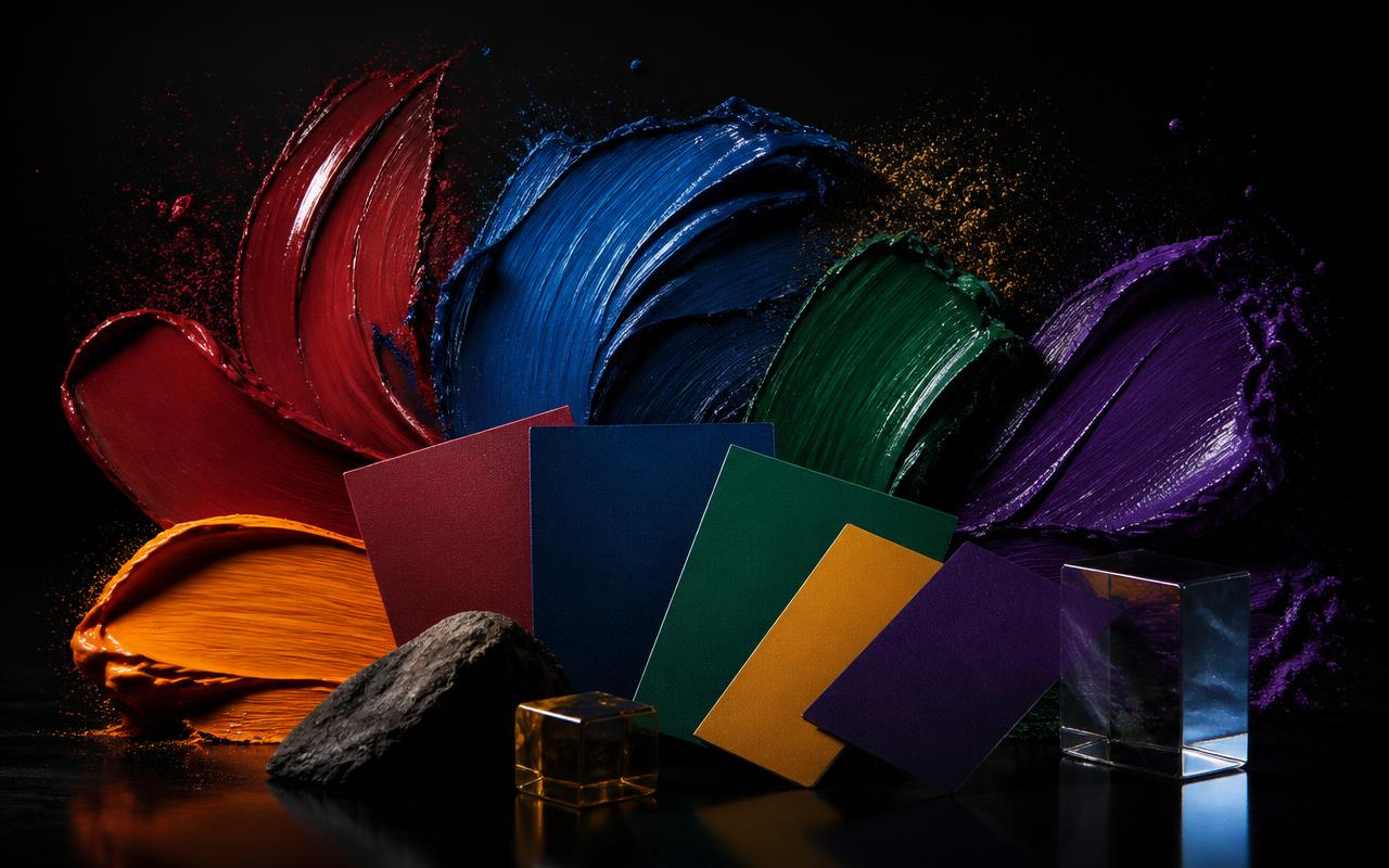
How colour actually influences buying decisions, brand memory and emotion — and how to build a palette that survives real-world use.
Oscar Graphix✦ Blog
Long-form articles on graphic design, branding, typography and the craft of running a serious design practice — written by the Oscar Graphix team.

The 10 non-negotiable principles that separate a memorable logo from a forgettable one — with real examples designers use every day.
Read article →

How colour actually influences buying decisions, brand memory and emotion — and how to build a palette that survives real-world use.


Kerning, leading, tracking, hierarchy and pairing — the fundamentals that make text feel invisible in the best possible way.


Identity is what you design. Image is what people remember. Understanding the gap between them is where great branding starts.


A designer's straight-answer guide to picking the right Adobe tool for logos, posters, edits, mockups and social content.


The honest list — which AI tools save real time for designers, which are overhyped, and how to use them without losing craft.


Minimalism is not a trend — it is a discipline. Here is how to design less that says more without ending up bland.


Colour modes, resolution, bleed, fonts, file formats — a working designer's checklist for jumping between print and screen.


Structure, materials, dielines, hierarchy and shelf impact — how to design packaging that sells before anyone reads a word.


Sizes, safe zones, motion, contrast and hooks — how to design social content that stops the scroll instead of blending in.


They share tools but not goals. A clear breakdown of what each discipline does — and how to move between them without losing your edge.


A friendly reference for clients and designers — which logo file to send for print, web, embroidery, video and merchandise.


Columns, gutters, baselines and modular grids — the invisible architecture that holds every great layout together.


Beyond 'red means excitement' — how colour choices influence click-through, memory and buying decisions across cultures.


Rates, contracts, clients, positioning, tools and the mindset shifts nobody teaches you in design school.


Handpicked typefaces that feel modern, versatile and safe for real client work — with pairing recommendations for each.


A framework for setting confident prices — hourly, project and value-based — with real ranges and negotiation tips.


The recurring errors that hurt beginner and mid-level designers most — with the quick fixes that separate good work from great.


A practical structure for brand guidelines — logo rules, colours, type, voice, motion — designed to be followed, not filed away.


Why one blurs and one scales, when to use each, and how mixing them cleanly is a mark of experienced designers.


Stocks, finishes, typography, hierarchy and print specs — everything you need to design business cards that feel worth handing over.


Scale, focal point, type, contrast and print production — the fundamentals behind posters that actually get noticed.


Contrast, colour, typography, alt text and inclusive imagery — accessibility is design quality, not an add-on.


Why every graphic designer should learn a little motion — and the minimum viable workflow to add animation to your practice.


What hiring managers and clients look for in a portfolio in 2026 — case studies, curation, presentation and the mistakes that get you skipped.
✦ Have a project in mind?
Get a proposal from Oscar Graphix — branding, print, web and digital marketing built for growth.